Brand Identity and Packaging
SWASH Laundry Detergent
We created a hype video highlighting the new SWASH Laundry Detergent while showcasing the three distinctive scents with unique visuals that speak to enhancing customers’ laundry experience.
The SWASH logo was designed with precision to ensure it stands out from every angle, readable both upright and upside-down. The simple, centered layout and bold blue and white contrast make the logo the focal point, maximizing its impact on the shelf and when the bottle is squeezed.
Swash brand colors are bold, pure, and saturated, mixed with bright white. The primary brand palette is a trio of eye catching blues, complemented with a scent-specific suite of colors as fresh as washed linens.
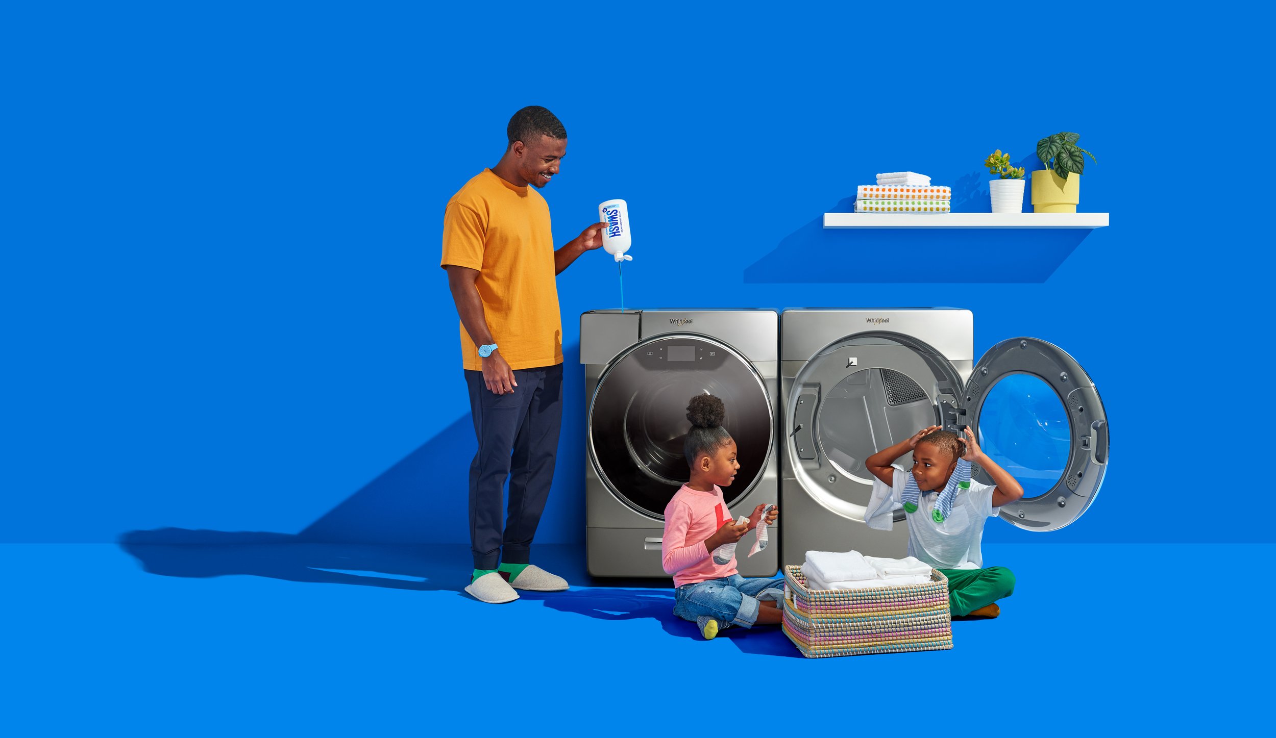
We brought SWASH to life with a blend of still-life imagery and action shots, each inspired by the unique scents. Vibrant brand-color backgrounds added simplicity and energy, while warm, focused lighting amplified the colors and cast dramatic shadows, creating a bold and dynamic aesthetic.
We refined the brand identity into streamlined, comprehensive guidelines, creating a lasting foundation for producing future materials that maintain SWASH’s bold and vibrant essence. These guidelines also played a key role in strengthening the brand’s web presence, ensuring consistency and impact across digital platforms.
The new SWASH brand identity translated seamlessly online, creating a cohesive and impactful web presence. Vibrant colors, clean typography, and user-friendly layouts enhanced the digital experience, reinforcing the brand’s bold, eco-conscious image.


